

I’m not a data scientist. I’m a marketer who got tired of waiting three days for a developer to pull a report. So I spent several weeks stress-testing every “no-code AI analytics” tool I could find — with real datasets, ugly CSVs, and genuinely annoying questions. Here’s the unfiltered breakdown.
There’s a version of this article that just lists five tools with a paragraph each and a bunch of green checkmarks. That’s not this.
I want to explain why these tools work the way they do, what the AI is actually doing under the hood (in plain terms), and where each one falls apart — because they all fall apart somewhere.
The question I kept asking myself while testing: if someone handed me a 50,000-row spreadsheet right now and said “figure out what’s driving our churn,” which of these tools would I actually open? The answer changed depending on what role I was playing. And that matters.
How I tested: I used a mix of datasets — e-commerce sales data (~40k rows), a HR attrition dataset from Kaggle, and a messy multi-sheet marketing analytics export. No cleaning beforehand. I asked each tool the same 10 questions ranging from simple (“show me revenue by month”) to genuinely analytical (“which product category is most responsible for declining average order value in Q3?”).
Side-by-Side Comparison
| Tool | Best Use Case | AI Approach | File Limit | Predictive ML | Automation | Starting Price | Overall Score |
| Julius AI | Deep exploratory analysis | Python code generation | ~5MB practical | Limited | No | Free / $20/mo | 8.5 / 10 |
| ChatGPT ADA | Ad hoc statistical questions | Python code generation | 512MB (slow past 5MB) | Manual prompting | No | $20/mo (Plus) | 8.2 / 10 |
| Polymer Search | Dashboard creation & sharing | Schema inference + chart AI | Up to 5M rows | No | Partial | Free / $10/mo | 7.5 / 10 |
| Zams (formerly Obviously AI) | Predictive modelling (AutoML) | AutoML pipeline | Large files supported | Yes — core feature | Basic | Free trial / $75/mo | 7.9 / 10 |
| Akkio | Recurring team workflows | NLP + SQL engine | Connector-dependent | Yes | Yes — core feature | Free trial / $50/mo | 8.0 / 10 |
1. Julius AI
The one that actually feels like talking to an analyst
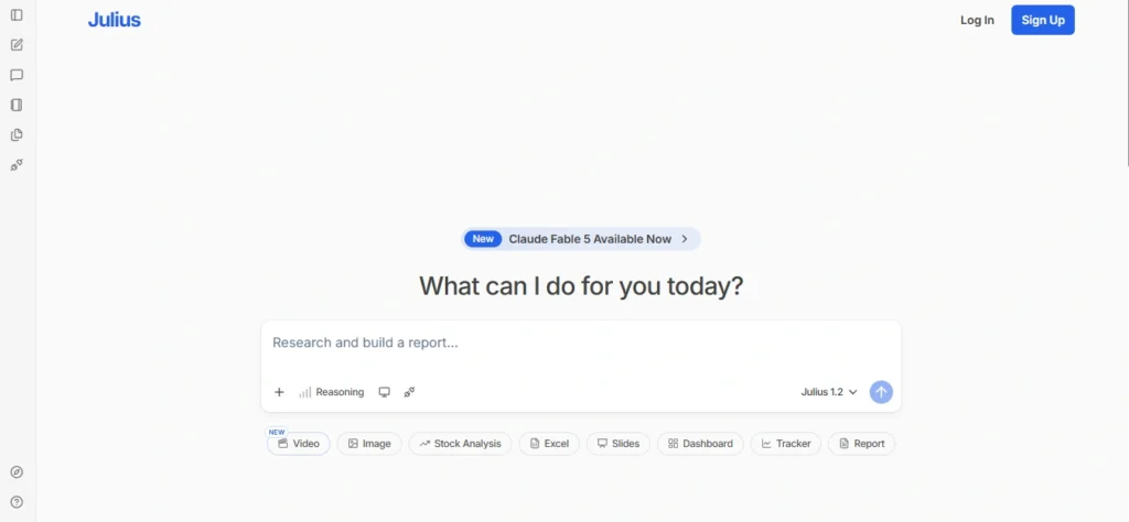
Julius is the tool I keep coming back to. The core mechanic is simple: you upload a CSV or connect a Google Sheet, then ask questions in plain English. What’s different from the other tools on this list is that Julius shows you the Python code it runs behind the scenes — and you can edit it. That transparency is what makes it genuinely useful rather than just flashy.
When I asked “which sales rep had the highest revenue in Q3 but the lowest close rate?”, it didn’t just return a number — it wrote a multi-step analysis, grouped by rep, calculated close rate as a derived metric, and sorted both.
That’s not pattern-matching on my question; it’s actual reasoning. It then presented the answer in a table and offered to visualise it. I clicked yes. The chart was decent, not beautiful, but readable.
Where Julius struggles: very large files (above ~5MB) slow it down noticeably, and if your data has inconsistent date formats across columns, it sometimes makes wrong assumptions without flagging them. I caught one instance where it silently treated “Nov ’23” and “11/2023” as two different time periods. Not great. You need to verify edge cases.
What the AI is actually doing
Julius uses a language model to interpret your question, translates it into executable Python (pandas, matplotlib), runs it in a sandboxed environment, and returns the result with a natural language explanation.
It’s a code-generation layer on top of a Python runtime — which is why it’s more capable than tools that just do drag-and-drop analytics.
- Best for: Analysts who want power without writing code
- Watch for: Silent data type assumptions
- Pricing: Free tier / Pro from ~$20/mo
| Metric | Score |
| Ease of use | 8.8 |
| Analytical depth | 9.0 |
| Visualisation | 7.2 |
| Data handling | 8.0 |
2.ChatGPT Advanced Data Analysis
The Swiss Army knife — good at everything, master of nothing
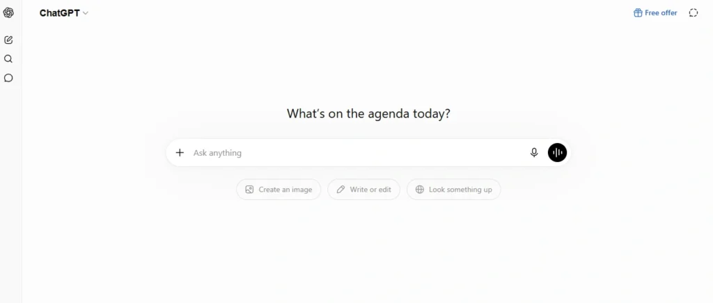
OpenAI’s “Advanced Data Analysis” feature (previously called Code Interpreter) deserves a spot here because millions of people already have access to it and don’t realise how capable it is for data work.
The mechanism is identical to Julius in principle — it generates and executes Python code — but the conversational ability around the data is substantially better, because it’s built on top of GPT-4o.
The standout moment in my testing: I uploaded the HR attrition dataset and asked “what’s the single biggest predictor of employee turnover here?” Without any prompting about methodology, it ran a correlation analysis, flagged overtime hours and job satisfaction as the top two factors, then offered to run a logistic regression to validate.
That’s genuinely impressive from a no-code standpoint. It explained every step in a way my non-technical team lead could follow.
The limitation that’ll frustrate you: file size caps (currently 512MB per file, but analysis slows dramatically past a few MBs in practice), no persistent memory across sessions (you have to re-upload your data every time), and the conversation format can become unwieldy for iterative analysis. If you’re going back and forth 20 times on the same dataset, you’ll be fighting the interface.
What the AI is actually doing
Same Python sandbox approach as Julius, but the prompt-to-code translation is handled by a more capable base model.
The key difference is that ChatGPT can hold more complex reasoning chains before generating code — so for statistical questions, it often picks a better method than Julius does on the first attempt.
- Best for: One-off exploratory analysis, ad hoc questions
- Watch for: No persistent workspace between sessions
- Pricing: ChatGPT Plus — $20/mo (includes this feature)
| Metric | Score |
| Ease of use | 8.2 |
| Analytical depth | 9.2 |
| Visualisation | 7.8 |
| Data handling | 7.5 |
3.Polymer Search
Built for teams who want dashboards, not conversations
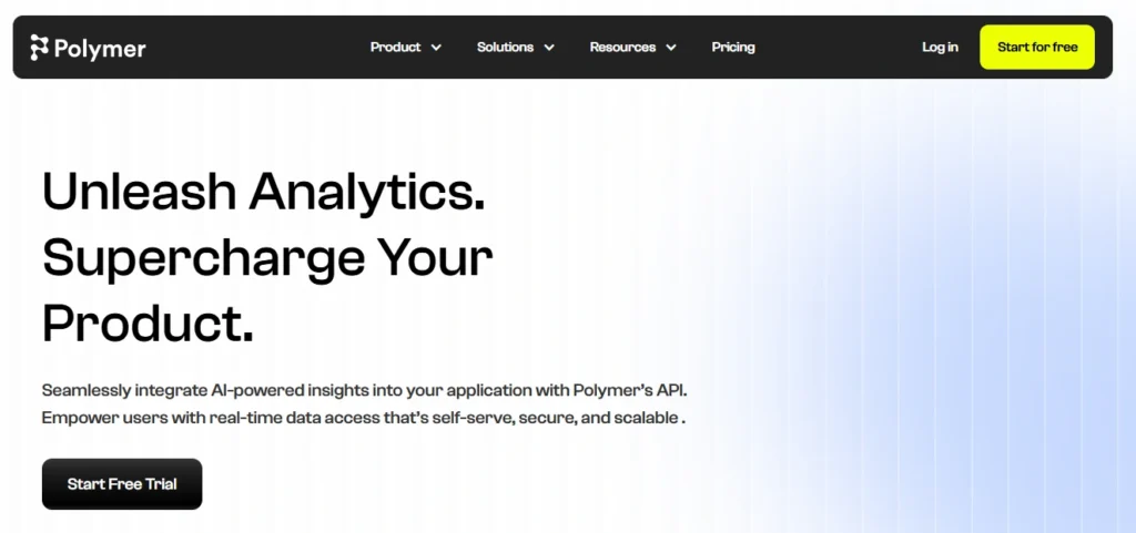
Polymer is the most visually polished tool I tested. You upload a CSV, and within about 30 seconds it has auto-generated an entire dashboard — charts, filters, KPI cards, the works. There’s no “chat” interface here.
Instead, you use a combination of AI-suggested views and a drag-and-drop builder to explore your data.
For the e-commerce dataset, Polymer immediately surfaced things like revenue by category, order volume trends, and average order value — before I asked for any of it.
It scanned the column names and data types and made reasonable guesses about what was worth visualising. That’s actually useful for someone who doesn’t know what they’re looking for yet.
But here’s where my patience ran out: Polymer is not built for analysis. It’s built for reporting. When I asked nuanced questions — “show me customers who bought in Q1 but not Q2, and what did they originally purchase?” — it couldn’t handle the multi-step logic. It’s an excellent tool if you need to turn a clean dataset into a shareable dashboard in under an hour. It is not the tool if you’re trying to figure something out.
What the AI is actually doing
Polymer’s AI does two things: it classifies your column types (dates, categories, numerics, IDs) and uses that classification to recommend visualisation types. It’s closer to automated BI than conversational AI.
There’s no code generation happening. The “AI” part is really smart schema inference plus a recommendation engine for chart types — not a reasoning model.
- Best for: Sharing insights with stakeholders fast
- Watch for: Not suited for complex, multi-step queries
- Pricing: Free / Starter from $10/mo
| Metric | Score |
| Ease of use | 9.5 |
| Analytical depth | 5.2 |
| Visualisation | 9.4 |
| Data handling | 7.8 |
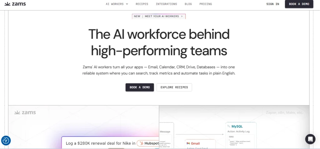
4.Zams (formerly Obviously AI)
When you want a prediction, not just a chart
This one does something none of the others do out of the box: predictive modelling. You connect your data, tell Obviously AI which column you want to predict (churn, revenue, likelihood to convert, whatever), and it builds and evaluates multiple ML models automatically, then presents the best one with an accuracy score and a feature importance breakdown.
I tested it on the HR dataset with “predict whether an employee will leave.” It identified overtime hours, job level, and years since last promotion as the top three drivers — which aligns with what you’d expect from the literature on burnout.
The model accuracy came in around 87%, which honestly surprised me for a no-code tool. It also let me run predictions on new rows, which is the actual end goal for most use cases.
The honest caveat: Obviously AI abstracts away so much of the modelling process that it’s very easy to get a result that looks credible but is methodologically shaky. It doesn’t warn you about class imbalances in your target variable, overfitting risks, or whether your training data is large enough to generalise.
If you take the outputs at face value without some domain knowledge, you fall straight into the AI adoption illusion and can make bad decisions with a lot of confidence.
What the AI is actually doing
Under the hood, Obviously AI runs an AutoML pipeline — it tries multiple algorithms (logistic regression, gradient boosting, random forests, etc.), evaluates them on held-out data, and returns the winner. The “no-code” experience is a well-designed UI wrapper around this pipeline.
What you’re trusting the AI to do is feature selection and model selection, both of which require genuine statistical understanding to validate.
- Best for: Building predictive models without a data scientist
- Watch for: Outputs can look trustworthy even when they’re not
- Pricing: Free trial / Paid plans from ~$75/mo
| Metric | Score |
| Ease of use | 8.5 |
| Analytical depth | 8.7 |
| Visualisation | 7.4 |
| Data handling | 8.2 |
5.Akkio
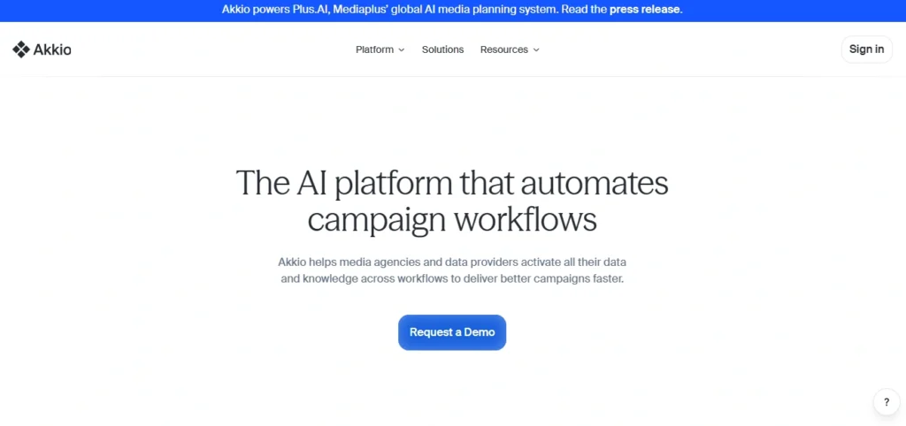
The agency and ops team’s pick — built for recurring workflows
Akkio positions itself at teams and agencies, and that focus shows in the product decisions. It has the best data connector ecosystem of any tool I tested — Salesforce, HubSpot, Google Sheets, BigQuery, Snowflake.
Once connected, you can set up automated analyses that run on a schedule and push results somewhere (Slack, email, a dashboard). That’s genuinely different from everything else on this list.
The AI chat interface is solid for basic questions but not as sophisticated as Julius or ChatGPT for deep exploratory analysis.
Where Akkio shines is when you already know what you want to track and you want an intelligent system to power your recurring data workflows consistently without manual intervention every week. I set up a “weekly churn risk flagging” flow in about 25 minutes. It’s been running on its own since.
The pricing reflects this B2B positioning — it’s not a tool you’ll casually subscribe to as an individual. The free tier is extremely limited. If you’re evaluating this for a team, the ROI makes sense. If you’re a solo analyst just wanting to answer questions about a spreadsheet, you’re paying for features you’ll never touch.
What the AI is actually doing
Akkio combines a natural language interface with a workflow automation engine. The NLP layer handles query interpretation; the backend executes SQL-style logic against your connected data sources.
Its predictive capabilities are similar to Obviously AI but better integrated into automated workflows. For recurring business intelligence needs, this architecture is more practical than a chat-first interface.
- Best for: Teams running recurring data workflows
- Watch for: Overkill for individual or one-off use
- Pricing: Free trial / Team plans from ~$50/mo
| Metric | Score |
| Ease of use | 8.0 |
| Analytical depth | 7.9 |
| Visualisation | 8.0 |
| Data handling | 9.1 |
Who Should Actually Use What
- If you’re a marketer or product manager who needs to answer questions from a one-off data export: Start with Julius AI or ChatGPT ADA. You’ll get the most analytical horsepower without needing to understand what’s happening underneath.
- If you’re building a report to share with a leadership team or a client: Polymer. Nothing else comes close for polish-to-effort ratio. Just know that you’re making a reporting tool, not doing analysis.
- If your goal is literally “I want to predict X” and X is a binary outcome you have historical data for: Obviously AI. Go in with appropriate scepticism about the accuracy claims, validate with someone who understands model evaluation, but for a first pass it’s genuinely impressive.
- If you’re running an ops team or an agency and you need the same analysis to run automatically every week: Akkio. It’s the only tool here that’s built for that workflow. The pricing is annoying for small teams, but the time saved is real.
The thing nobody tells you: None of these tools replace the question-asking skill. The AI is only as useful as the question you give it. Garbage question → garbage answer, no matter how sophisticated the model. I’ve seen people get wildly misleading outputs from these tools simply because they asked “what’s the trend?” without specifying which metric or time range. Specificity is your most important skill when using these.
Questions People Actually Ask
- Can I use these tools with sensitive business data?
- Depends on the tool. Julius, ChatGPT, and Polymer all send data to external servers, so they’re not appropriate for HIPAA-regulated or legally restricted data without specific enterprise agreements. Akkio and Obviously AI offer enterprise plans with data processing agreements — check their terms for your jurisdiction. If data privacy is a concern, verify before uploading anything.
- Are these tools accurate enough to trust for business decisions?
- For descriptive analysis (what happened, by how much, when) — yes, with verification. For predictive analysis — treat outputs as a starting point, not a conclusion. Model accuracy numbers in tools like Obviously AI are calculated on the training data and can be misleading if your dataset is small or imbalanced. Sanity-check important outputs against what you know to be true about your business.
- Do I need to clean my data before using these tools?
- You’ll get better results if you do basic cleaning — consistent date formats, no merged header rows, clear column names. But tools like Julius and ChatGPT ADA handle messy data better than you’d expect. Polymer is the most sensitive to dirty data; it relies heavily on column type inference, and inconsistencies confuse it.
- Which is best for someone who has never done data analysis before?
- Polymer for getting a quick lay of the land visually, then Julius AI once you have specific questions. The combination of “automatic dashboard to orient yourself” and “conversational AI to go deeper” covers most of what a non-technical person needs.